KEIPhone logo & Brand building
KEIPhone is bridging the digital gender gap for women by providing free smart phones and solar chargers to unconnected women via an innovative advertising-based revenue model. ![]()
The logo and brand needed to be simple & clear, and the colours vibrant, positive and appealing to the main target audience.
Brand Image
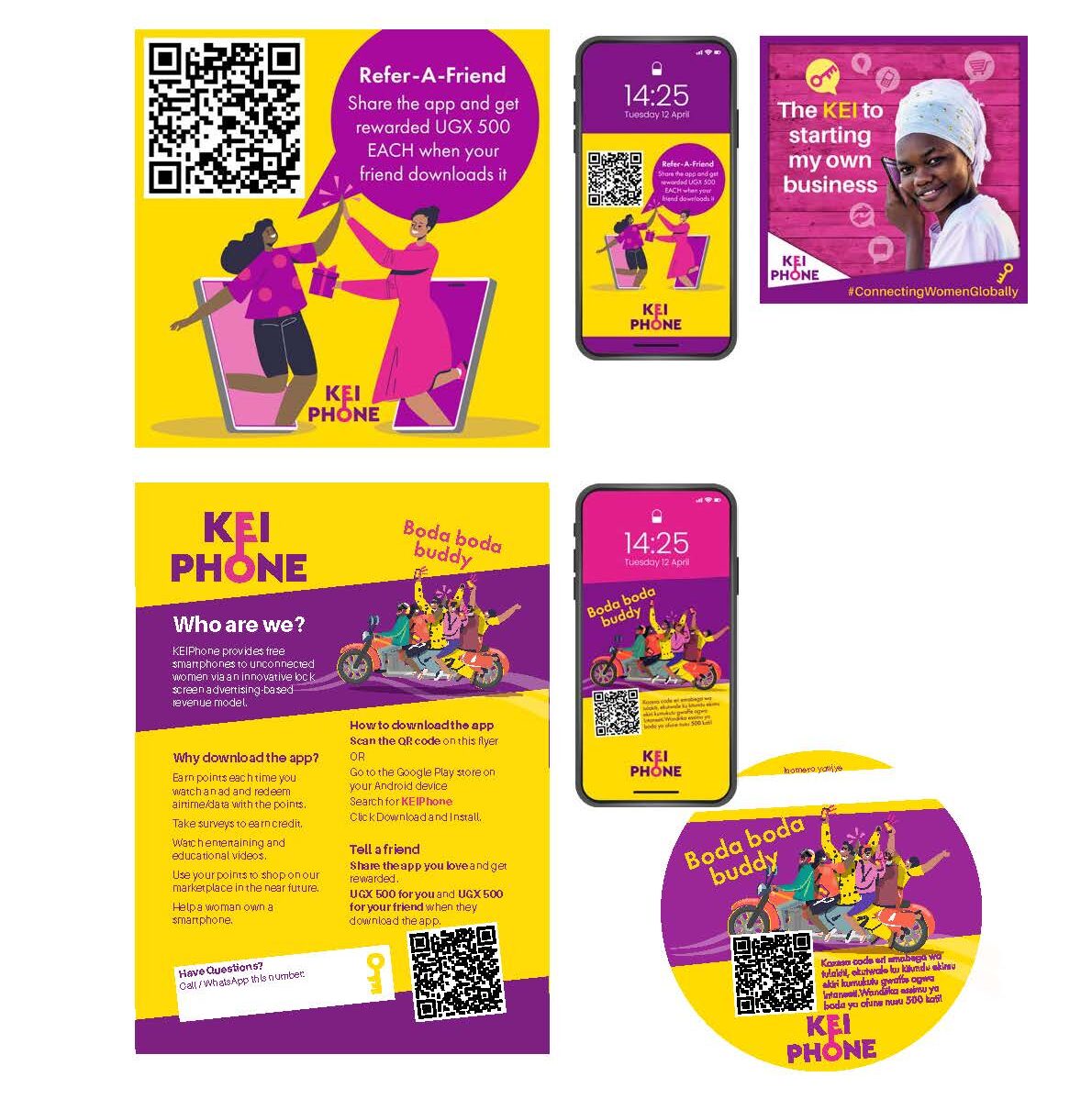
Materials targeting the end user are more colourful, playful and frequently make use of illustration.
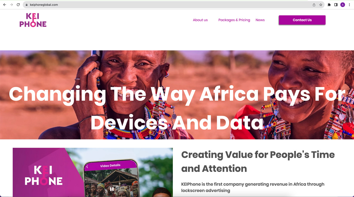
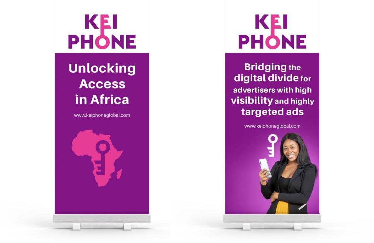
Materials aimed at investors, donors and policy-level work use less illustration and mainly uses the primary brand colours (purple, pink & white).
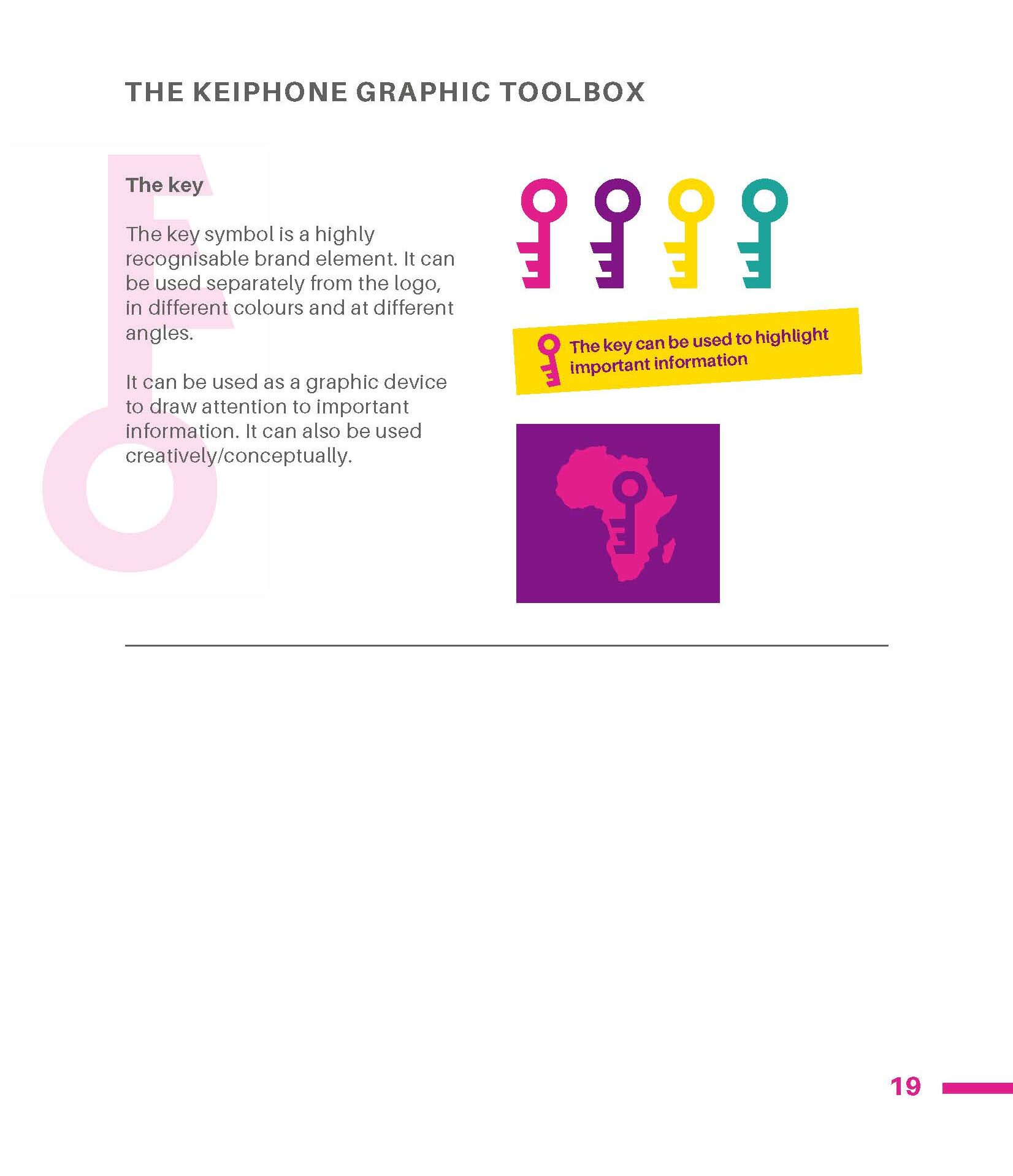
Brand Manual
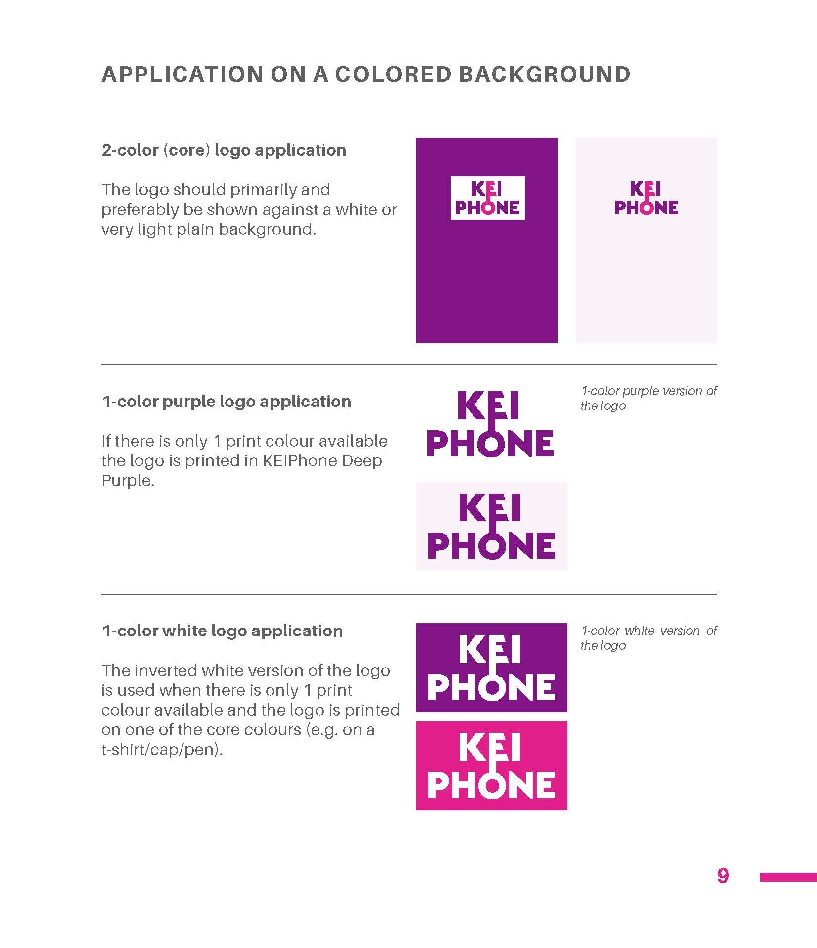
Sample pages from the brand manual.
Brands evolve, so the current 24 pages will continue to be developed as the brand grows and expands into other markets.